Initial Requirement and Basic Structure:
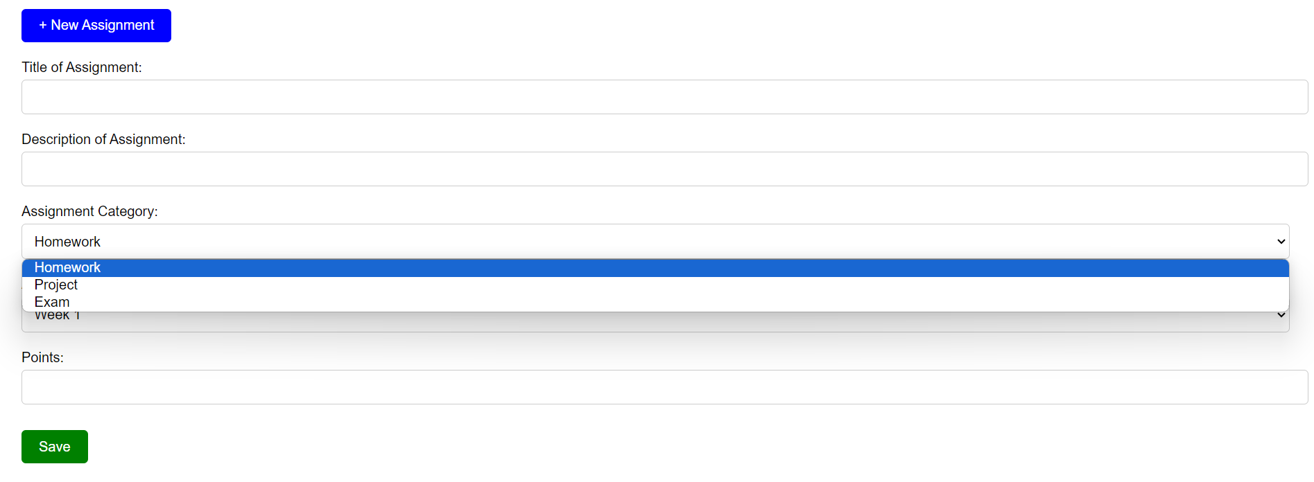
The inception of our project was rooted in a straightforward request: the creation of a utilitarian tool designed for assignment selection. The envisioned tool was to be equipped with a set of primary features. Firstly, a dropdown menu was to be incorporated, allowing users to select the specific week of the assignment. This was complemented by another dropdown menu, dedicated to the categorization of the assignment, be it homework, a project, or an exam. The final touch was the integration of an iframe, a pivotal component designed to display the content of the chosen assignment. The foundational HTML structure was thus:
<label for="week">Assignment Week:</label>
<select id="week" name="week" onchange="displayAssignment()"></select>

<label for="category">Assignment Category:</label>
<select id="category" name="category"></select>

<iframe id="assignmentIframe"></iframe>
Styling the Tool:
A tool, no matter how functional, requires an aesthetic touch to enhance user engagement. Recognizing this, we embarked on a journey to infuse our tool with a contemporary design. We opted for a neutral color palette, ensuring that the tool would be visually soothing. The choice of the ‘Roboto’ font further accentuated the modern essence of the tool. Special attention was given to the iframe, which was adorned with a subtle shadow, adding a touch of depth. The dropdowns, too, were meticulously styled to ensure visual consistency and ease of interaction.
<style>
body {
    font-family: 'Roboto', sans-serif;
    padding: 20px;
    background-color: #f4f4f4;
}
</style>

JAVASCRIPT OOP
Below are code snippets that demonstrate JS OOP for the respective feature:

Challenges with iFrames:
Every development journey encounters its set of challenges, and ours was no exception. Our primary hurdle emerged with the use of iframes. While iframes offer a convenient method to embed external content, they are not without limitations. Our initial implementation rendered the embedded content almost invisible due to the restricted height of the iframe. Recognizing the suboptimal user experience this presented, we undertook corrective measures, adjusting the height to ensure comprehensive visibility and enhanced user engagement.

Fetching Content Directly:
As we progressed, a realization dawned upon us: Why restrict ourselves to iframes when we could fetch and display content directly? Such an approach would transcend the boundaries of mere embedding, offering users an immersive experience as if the content was natively part of our tool. However, this ambitious endeavor was not without its challenges. The specter of CORS (Cross-Origin Resource Sharing) restrictions loomed large, and we had to ensure that the fetched content retained its original formatting and interactivity when displayed within our tool.
Documentation and Iterative Development:
The essence of our development journey was rooted in iteration. At every step, we sought feedback, critically analyzed our tool, and undertook refinements. This iterative approach, coupled with meticulous documentation, was instrumental in ensuring that our final product not only met the stipulated specifications but also resonated with the end-users, offering them a seamless and user-friendly experience.
Through this detailed exposition, we hope to provide a comprehensive insight into our development journey, highlighting the thought processes, challenges, and solutions that shaped our assignment selector tool.


Insights

